
Display a Round Profile Image
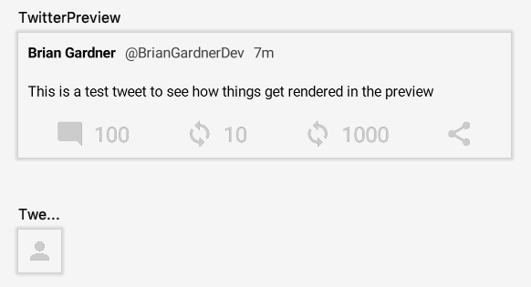
Twitter would not be complete without a round profile image on the left side of the Tweet. This post focuses on this last component of the Tweet view. For right now, a default profile image will be displayed for each Tweet instead of trying to download a photo.
Current issue
Downloading images into an ImageView on Android is mostly a solved problem. Libraries like Glide and Picasso provide fluent APIs for downloading images, performing transformations, and implement caching to boost app performance.
Unfortunately, these libraries do not currently work with Jetpack Compose. They rely on loading images into something like an ImageView so it may be a little while before they are updated to work with Compose.
Profile image compose function
The initial setup for the profile image mirrors the action row items. A vector asset is needed for the default user photo. This asset is loaded with the vectorResource function, which is displayed in an Icon.
The icon resource is added using the Vector Asset Studio just like the other action row icons. I used the person icon for the default asset and named it ic_profile_photo_default.
With the resource in place, the next step is adding a @Composable annotated function for the profile image and grab a reference to the default photo.
@Composable
fun ProfileImage() {
    val defaultPhoto = vectorResource(id = R.drawable.ic_profile_photo_default)
}
Next, the default photo is drawn into an Icon. I tried a few different sizes and ended up liking how the profile image looked at 36dp.
@Composable
fun ProfileImage() {
    val defaultPhoto = vectorResource(id = R.drawable.ic_profile_photo_default)
    Icon(
        asset = defaultPhoto,
        modifier = Modifier.preferredSize(36.dp),
        tint = Color.LightGray
    )
}
Before continuing further, I want to be able to preview my profile image and see how it looks. I could try adding it to the TweetView in its current state so it shows up in the existing preview but I would rather just focus on the profile image at this point. What I can do is create another @Preview annotated function in the same file.
@Preview
@Composable
fun TweetProfileImagePreview() {
    MaterialTheme {
        ProfileImage()
    }
}
After building the project, both preview functions will render in the preview pane. This is very useful for checking how separate compose functions render in the same file.
While the icon is displayed on the screen, it is difficult to see on a light background. Drawing the icon on top of a dark gray background would help it stand out. This is accomplished by wrapping the icon Icon in a Surface function and providing a background color. The Surface is drawn first and the icon is then drawn on top of it.
@Composable
fun ProfileImage() {
    val defaultPhoto = vectorResource(id = R.drawable.ic_profile_photo_default)
    Surface(
        color = Color.DarkGray
    ) {
        Icon(
            // Icon parameters collapsed
        )
    }
}
Building the project updates the preview pane and shows the new background.

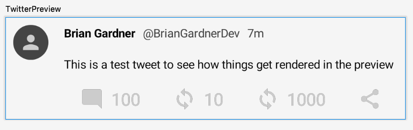
The background color looks good but the square shape does not. The profile image should be circular to match Twitter. The Surface accepts a shape parameter that will clip the child views to that shape.
@Composable
fun ProfileImage() {
    val defaultPhoto = vectorResource(id = R.drawable.ic_profile_photo_default)
    Surface(
        color = Color.DarkGray,
        shape = CircleShape
    ) {
        Icon(
            // Icon parameters collapsed
        )
    }
}
This code produces the pleasing, round profile image I am looking for.

The last update to the profile image is to add padding. This is achieved by providing the padding modifier to the Surface and specifying the amount.
@Composable
fun ProfileImage() {
    val defaultPhoto = vectorResource(id = R.drawable.ic_profile_photo_default)
    Surface(
        color = Color.DarkGray,
        shape = CircleShape,
        modifier = Modifier.padding(8.dp)
    ) {
        // Surface contents collapsed
    }
}
This ensures that the profile image always has a buffer between it and the other TweetView contents.

Display profile image in TweetView
With the profile image complete it just needs to be added to the TweetView. All of the Column contents in the TweetView remain the same. All that is needed is a top-level Row that displays the ProfileImage first.
@Composable
fun TweetView(state: MutableState<Tweet>) {
    val tweet = state.value
    val commentClick: (() -> Unit) = {
        // commentClick contents collapsed
    }
    val retweetToggle: ((Boolean) -> Unit) = { retweet ->
        // retweetToggle contents collapsed
    }
    val likedToggle: ((Boolean) -> Unit) = { liked ->
        // likedToggle contents collapsed
    }
    Row {
        ProfileImage()
        Column {
            // Column contents collapsed
        }
    }
}
This displays the user’s profile image in the correct place in the TweetView.
With that, the basic Tweet view is complete! It has been a long journey to get here but along the way I have learned a lot about how Compose displays data on the screen and I have grown to love this type of view creation. I am excited to see what Jetpack Compose introduces in the future and how it will change Android development.
Fortunately, this blog series is not ending here. In future posts I am going to focus on displaying a list of my TweetViews, adding an App Bar, displaying a floating action button above the list for adding a Tweet, and modifying the theme of my app.
Thanks again for reading and stay tuned for more!
Photo by Matt Botsford on Unsplash